Triyoga Re-brand
Triyoga is a haven for all Londoners to escape the busy hustle and bustle of city life. It’s a place to where people come together to share the experience of yoga.

Triyoga
Triyoga is London’s leading yoga and Pilates studio, offering yoga, Pilates and barre classes across Camden, Chelsea, Shoreditch, Ealing and Online.
Triyoga’s studios have been at the heart of London’s yoga community for the past 25 years, cultivating a loyal and dedicated audience. I had the opportunity to lead the brand refresh, with the aim to reposition the brand to attract and engage new demographics. The goal of the rebrand was to honour the studio’s heritage so as not to alienate the existing customer base, but also to refresh elements that felt plain or outdated to entice new attendees.


Brief
Previously, the branding relied on a single font and a lmited palette of four shades of purple. The new design introduced a refined, luxurious feel through a modern type suite for body text, headings, and subheadings, along with a revitalised colour palette inspired by nature. These changes unified the appearance of Triyoga’s print materials and social media, creating a cohesive and elevated visual identity.

Audience experience
The updated branding enhances the audience’s experience by evoking a sense of tranquility, sophistication, and inclusivity. The refined design not only makes the brand more visually appealing but also reinforces Triyoga’s position as a trusted boutique fitness and wellness studio.

A new direction
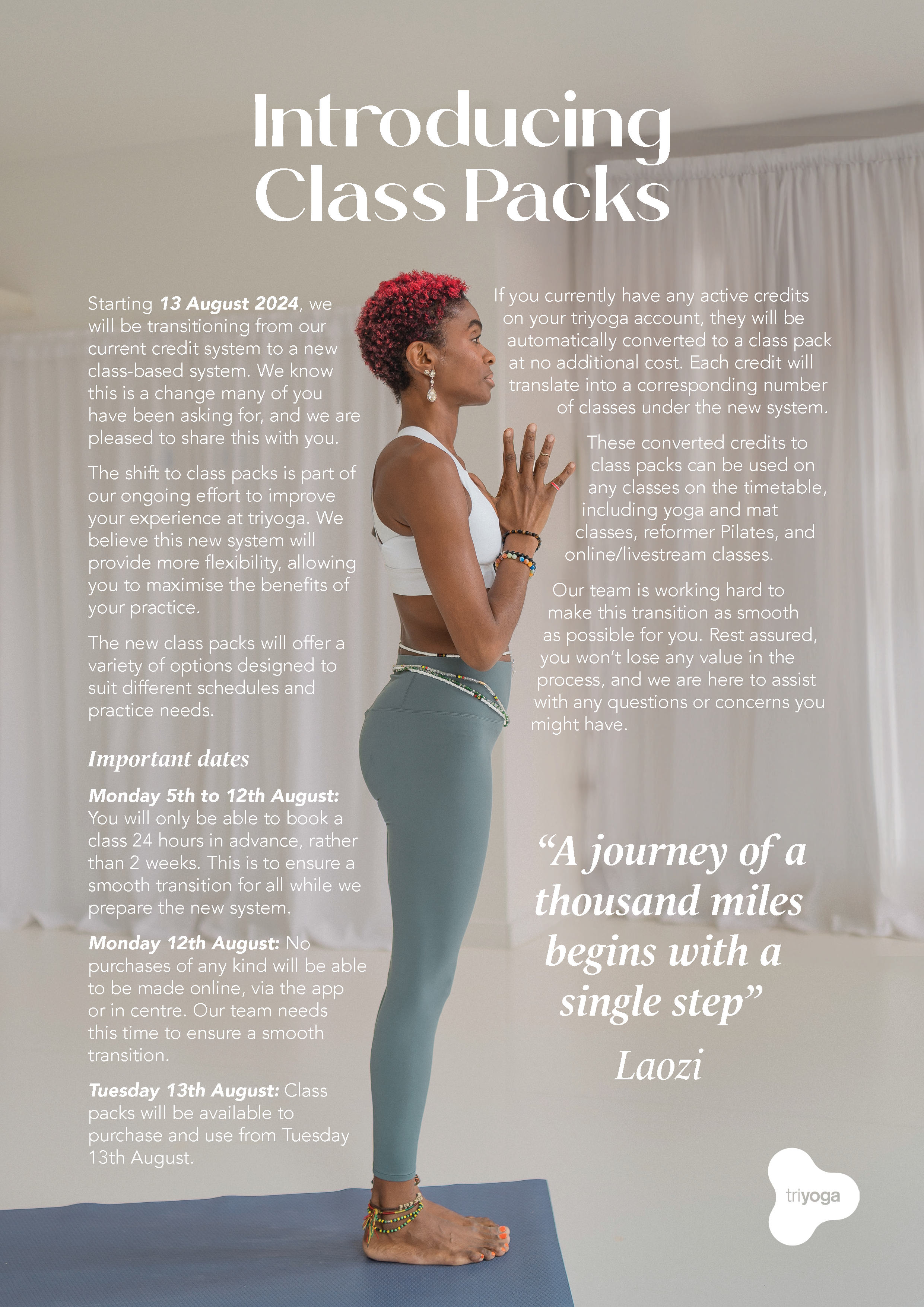
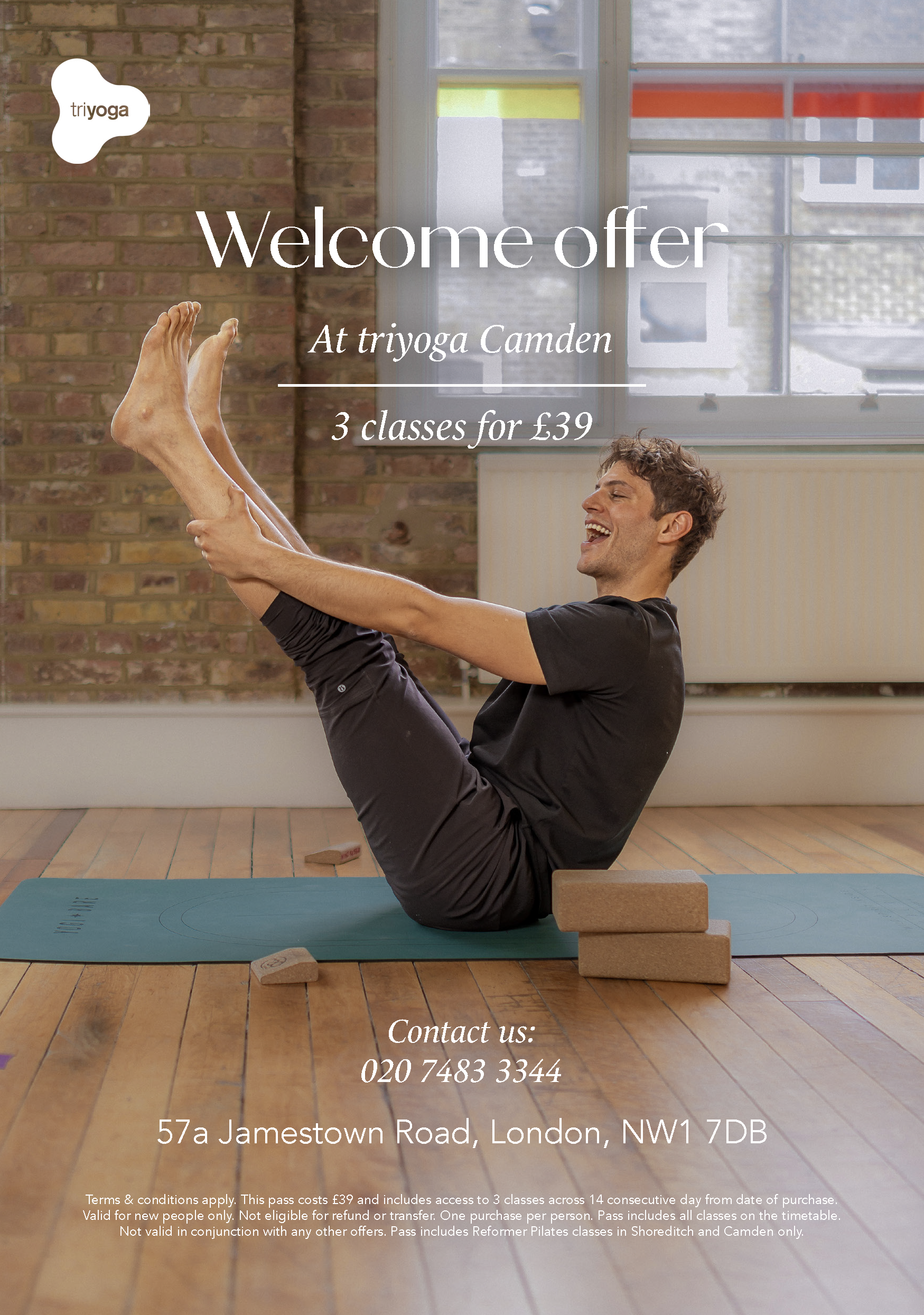
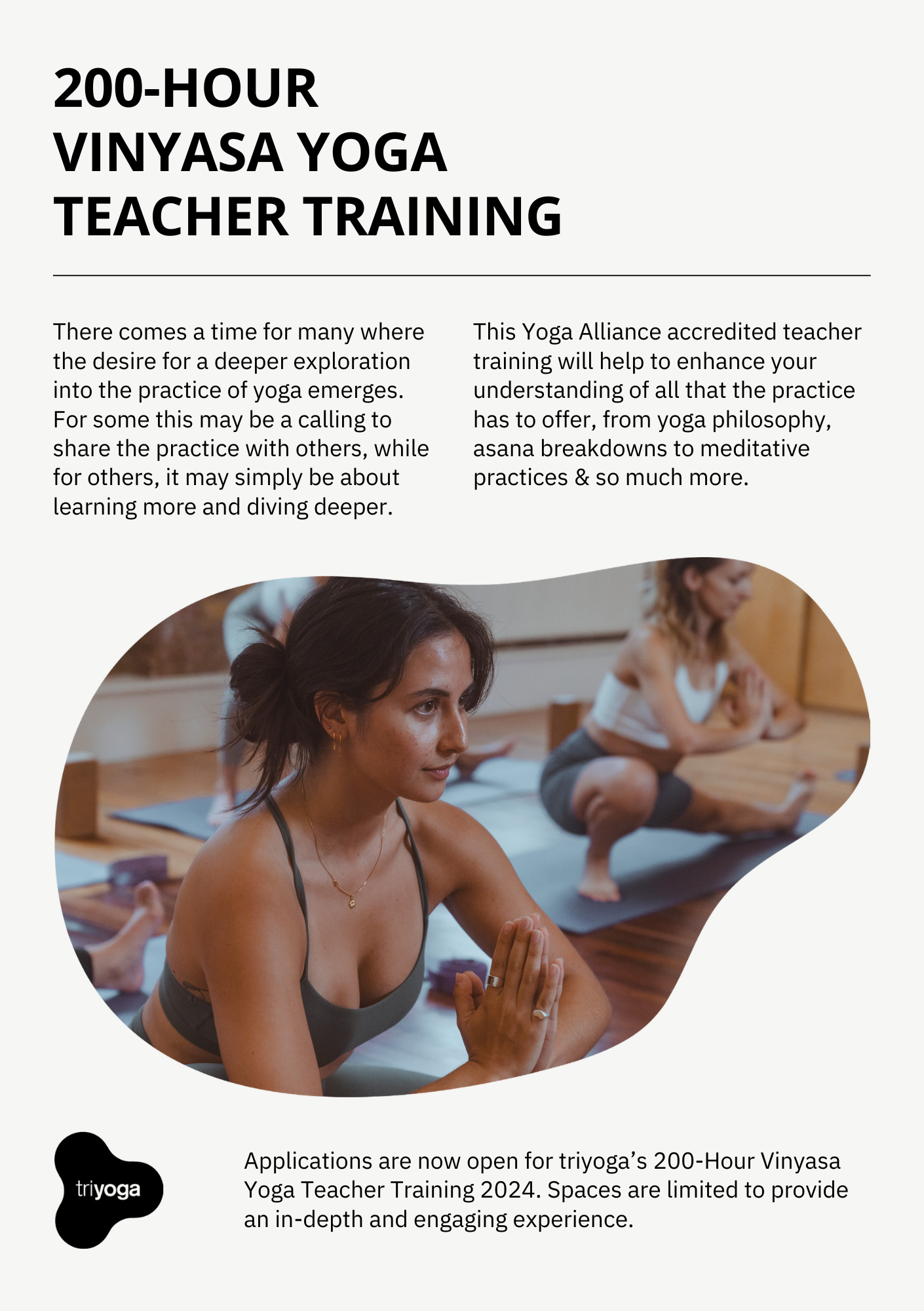
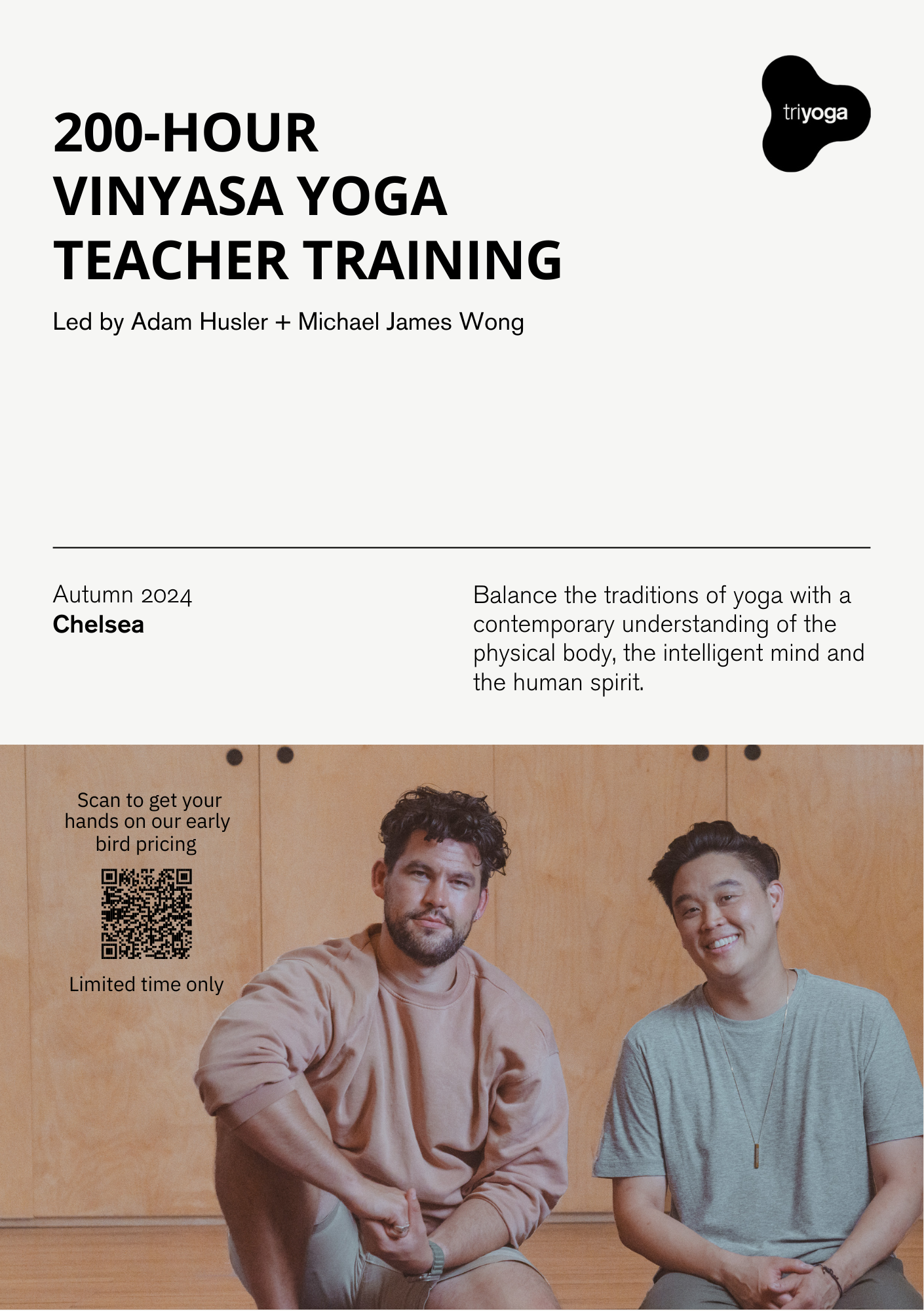
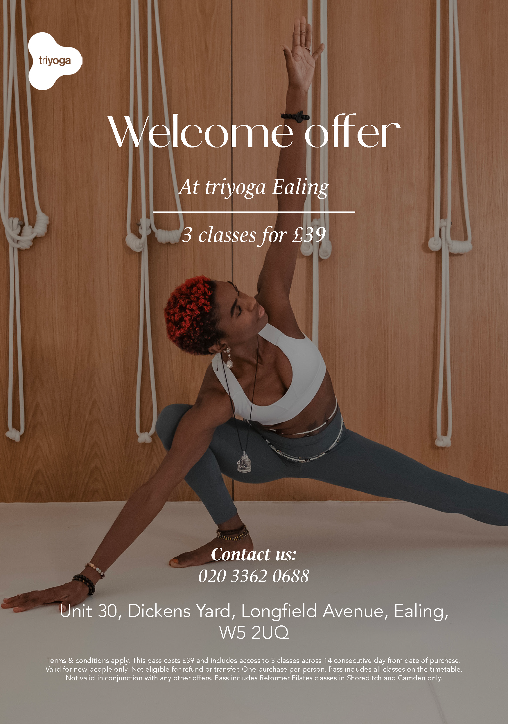
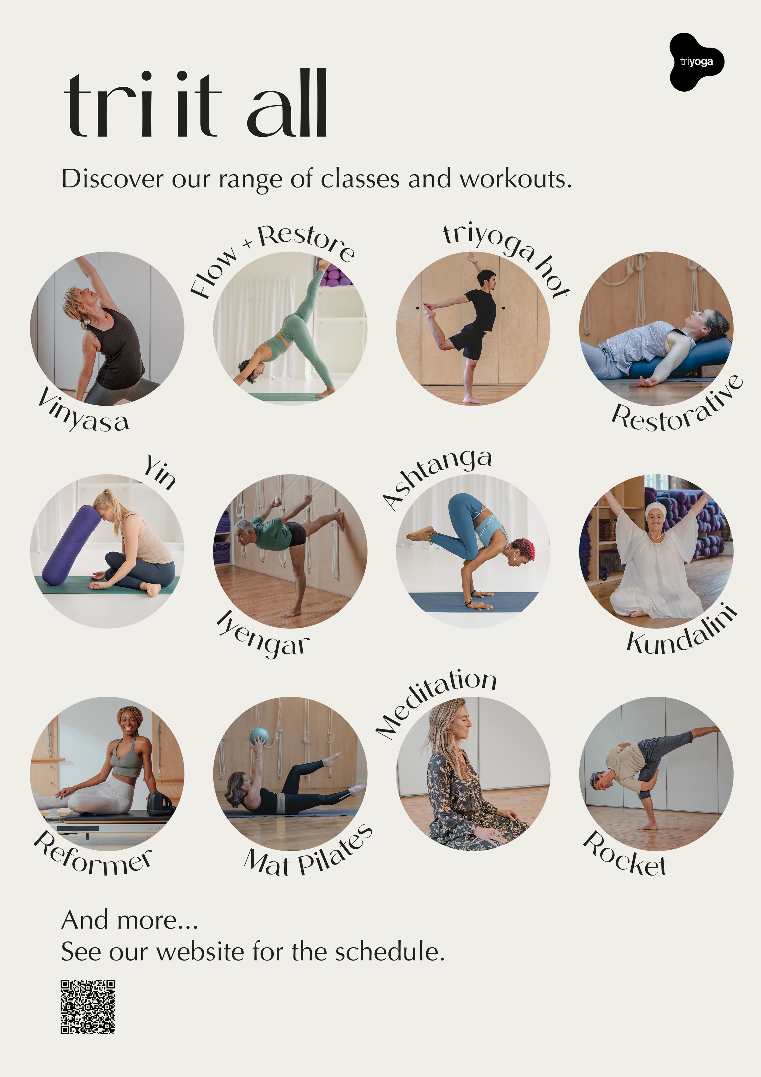
Among the range of assets I created were social media posts, advertisements, tote bags, posters, flyers, A-boards, business cards, wayfinding signage, and T-shirts.
The refreshed branding embodies the core principles of Triyoga—balance, harmony, and mindfulness—through its thoughtful design elements. The expanded colour palette, inspired by nature, evokes a sense of calm and grounding, while the clean and minimal typography mirrors the clarity and focus central to yoga practice. The updated photography style further enhances this connection, drawing from the tranquility and natural elements that define the studio's ethos.

Photography
The photography style also underwent a refresh, incorporating clean, bright imagery for the flagship studio and a warm, tranquil approach to highlight the earthy wood tones of the other locations. The result is a stunning minimalist aesthetic that captivates viewers and enhances the visual cohesion across all brand assets.


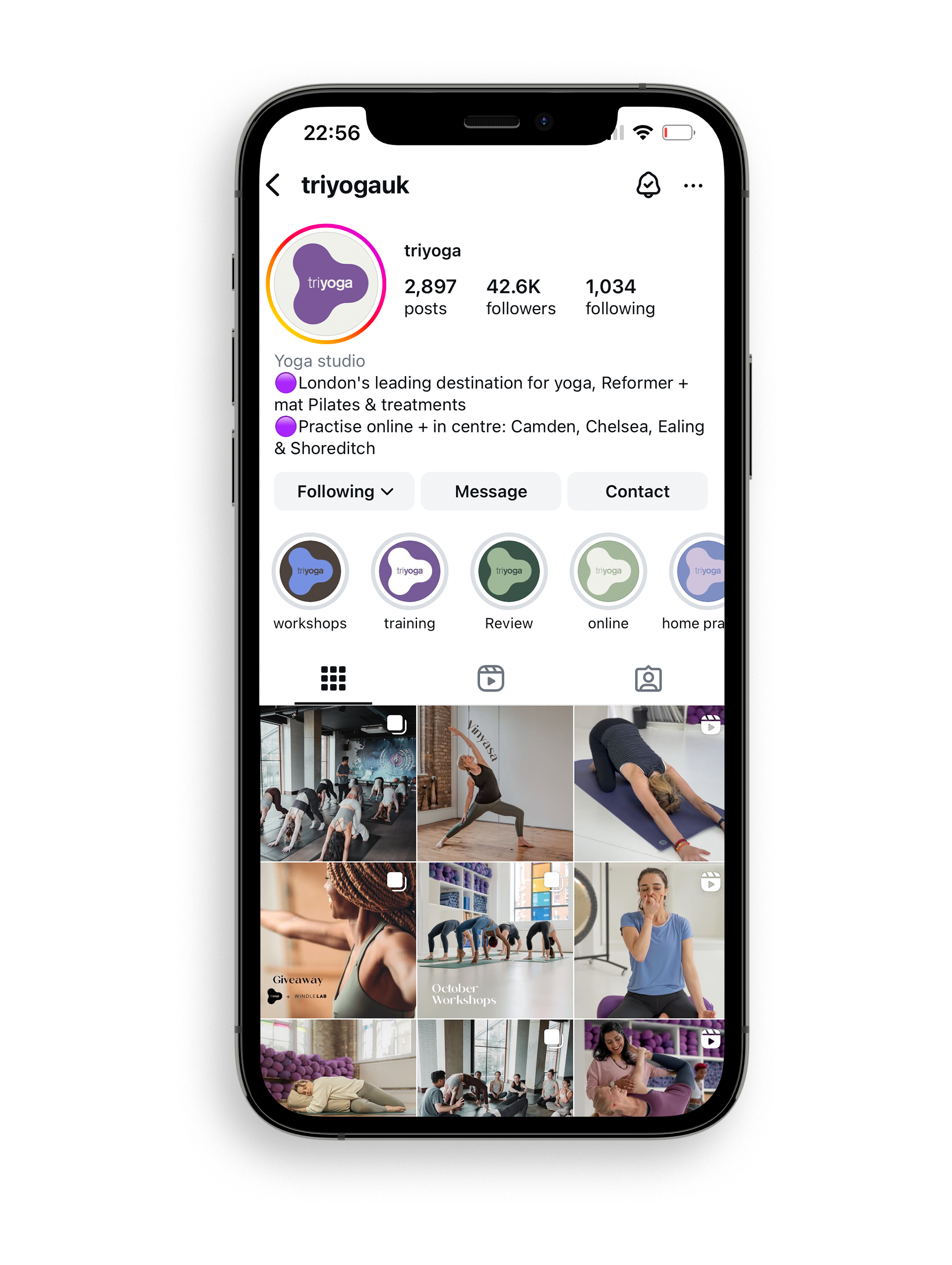
The instagram feed has benefited immensely from the rebrand, experiencing a significant boost in followers since its launch. I developed a refreshed style for posts and stories, bringing a vibrant new energy to the feed while ensuring a visually harmonious aesthetic. Collaborating closely with the social media manager, I provided creative guidance to achieve this cohesive and engaging new look, which has resonated strongly with the audience.